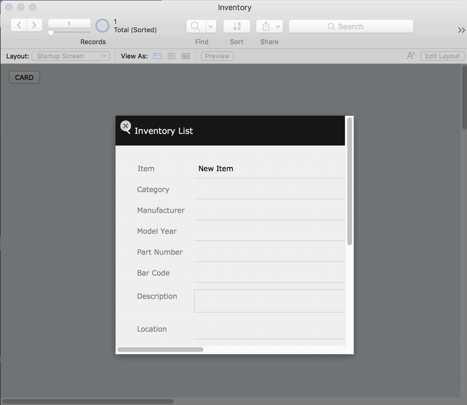
FileMaker 16 is here, and, once again, they're bulking up on the user interface features. New to the platform is a "card" style window. The card window is the true modal window that requires no tricks or hacks to work. For the first time, you'll be able to nest a layout inside of another layout.
While testing this out, we ran into a number of answers to how cards work in FileMaker that we wanted to share with the community. So let's look at what has changed in the New Window script step…
New window script behaviors
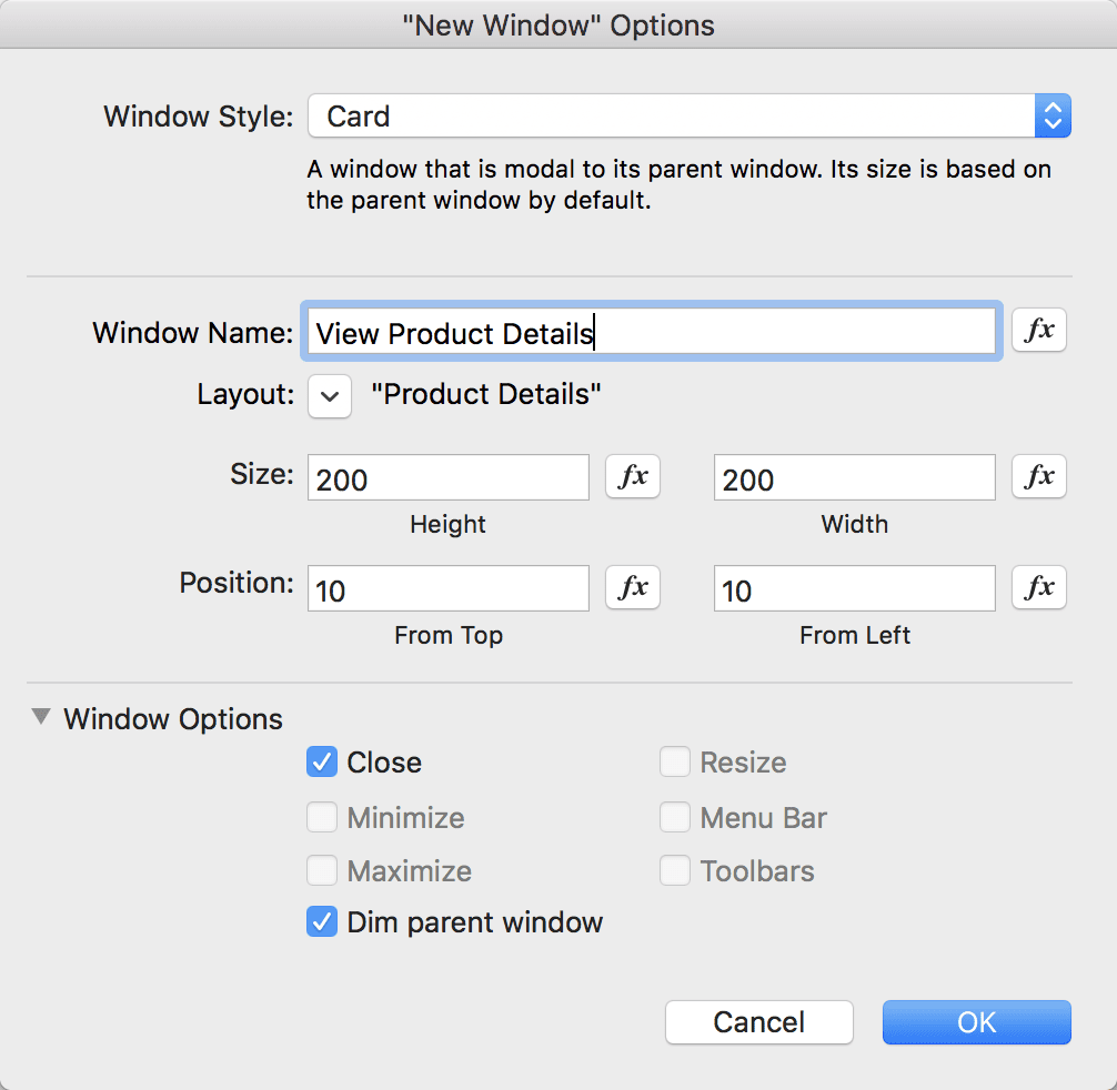
- Most noticeably, you’ll now be able to select a layout by reference or calculation (name or number) for all of the different window types. If you do not specify a layout, it’ll inherit the layout from the parent window where it was called.
- The options dialog box has been re-organized so it’s better suited for positioning parameters, and it includes short descriptions of each type of window. Window options are now together, rather than hidden under an advanced options secondary dialog.
- The other window types—document, floating document, and dialog—retain backwards compatibility and functionality
Card window specific behaviors
- We noticed that you cannot resize or zoom the parent window while a card is open
- Cards will auto-center in the parent window unless you specify a top/left position
- You have the option to either dim the background between the card and parent layout or not

- Unless the card dimensions are large enough to fit the entire layout content when the card is opened, vertical and horizontal scroll bars will automatically display on the card
- Window shortcuts work inside of cards. For instance, you can enter preview mode inside of the modal while the parent window stays in browse mode.
- Card windows only have a close option. The close button is either in the top left of the modal card window, or a button with “close window” attached to it can be used to close the modal.
- Since the card is technically a new window, we didn’t find any styling options for the card
- The card window handles normal window and layout script triggers as well (OnWindowOpen, OnWindowClose). Since the card window always spawns from a parent, though, OnFirstWindowOpen and OnLastWindowClose should never affect the card windows.
- While a card window is open, you won’t be able to click outside of the modal anywhere in the parent window
- You can close card windows with the keyboard shortcut (ctrl/cmd + W). Since layout triggers fire as well, you could also create a custom trigger (EG escape key) to trigger the window close.
So, what ideas did we have?
Here are a few we're going to try and work in…
- "Mixed Mode" windows. Our goal is to retain a found set in the parent window, while doing a new find inside of the modal window. This will allow you to create a separate "find form" layout for searching that can be different from the parent list view of results.
- Edit Form. Some people have resorted to using popovers in portals or list views as a means for a "quick edit" form. But with the card, you can easily create "New Record" or "Edit Record" modals that have a form view that will display on the card inside of your list view layout.
- Terms of Service. A common occurrence in many web apps is the appearance of a “terms of service” modal before any action is taken. The card window makes this type of "read and accept" window easy.
- Modal Preview. I’ve been using popovers with container fields as a large "preview" function for looking at larger-sized images or container content. The card window is a much cleaner look for this, though, and since it's another separate layout, I can also add other functionalities. This same concept could be applied to a large chart.
- Context Free "Quickform." Since the card is a completely separate layout/context, it’s now incredibly simple to add a form from any table to any other layout in the app. Say, for instance, I want an "add new contact" button anywhere in my system. I can easily script that so that a card opens up to a new record on a contact entry form, with save or cancel buttons. No complicated navigation, globals and scripting or trickery is required.
What are your ideas for the new card window?
Please share your comments with us below!
About the Author

Mike Beargie has been with MainSpring since 2013 and has over 10 years of application development experience. As a developer, he creates solutions for clients in a wide variety of sectors across the U.S. and abroad. Prior to working at MainSpring, Mike worked as the lead developer for a consulting company, serving high profile political, special interest and nonprofit clients in the Washington, D.C., and Columbus, Ohio, markets. Mike regularly presents solutions and best practices to the FileMaker development community around the country, and is well known as an answer man online as well. In 2014 and 2016, Mike was recognized with the FileMaker Excellence Award for community contributions. Mike is a man of many hobbies, including woodworking, home brewing, art and music.

